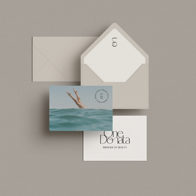
Serena Ray Visual Identity
Project Overview
Serena Ray is a conceptual brand identity crafted for an inspiring female thought leader or coach. This brand represents a woman with a mission to empower others, encourage self-reflection, and promote personal growth. She embodies boldness, authenticity, and radiance, a figure who not only shares wisdom but also motivates her audience to embrace their unique paths.
Design Approach
For Serena Ray, I envisioned a brand that reflects both grace and strength, blending classic elegance with a modern touch. The design centers around a bespoke floral emblem, symbolizing growth, resilience, and inner beauty. The color palette combines earthy neutrals with soft, muted blues and rich browns, capturing a harmonious balance that feels both grounding and sophisticated.
Typography plays a vital role in Serena Ray’s identity, with a striking, refined serif font for the brand name that suggests authority and warmth. A secondary sans-serif font complements the primary typography, ensuring readability and versatility across various applications. The overall look is cohesive, timeless, and radiant, echoing the coach's message of embracing one's own unique radiance.
Brand Elements and Applications
The Serena Ray identity features various brand elements that convey professionalism and approachability:
- Business Cards and Stationery: Elegant business cards, postcards, and letterhead designs project a cohesive brand image, ideal for networking and client communications.
- Digital Collateral: Social media graphics and templates reflect a unified visual tone, helping Serena Ray connect authentically with her online audience.
- Visual Accents: The floral emblem serves as both a standalone mark and a decorative accent, adaptable for use on branded packaging, merchandise, and digital platforms.
Outcome
The final brand identity for Serena Ray embodies a sense of calm authority and invites others to engage with a brand that feels both inspiring and down-to-earth. It’s a visual representation of a thought leader who empowers others to “Be Bold, Be Radiant.” Through consistent, refined branding, Serena Ray now has a cohesive look that communicates her mission to uplift and guide her audience with elegance and authenticity.
Note:
This project was created as a personal passion project, capturing the essence of a female thought leader in a visual identity that is as inspiring as her message.


